User customization and configuration is something I have always found very important – be it in the form of appearance options, application settings, and so on. When it comes to something I use heavily – be it a particular website, a specific program, a game, or even the desktop OS that all of it runs on, I want to be able to decide how I use it. I want to decide what it looks like with as much granularity as possible. For a while, these kinds of choices were commonplace – but as time has gone on, many websites and software and operating systems (or at least, a certain OS made by Microsoft that you might have heard of) have slowly chipped away at what could be done.
I am mostly going to be focusing on appearance and visual customization, as these are the easiest to discuss and, for me personally, these are the kinds of options that I find myself most frustrated at losing – though this problem most definitely doesn’t just apply to visual settings.
Colors and Fonts – Windows
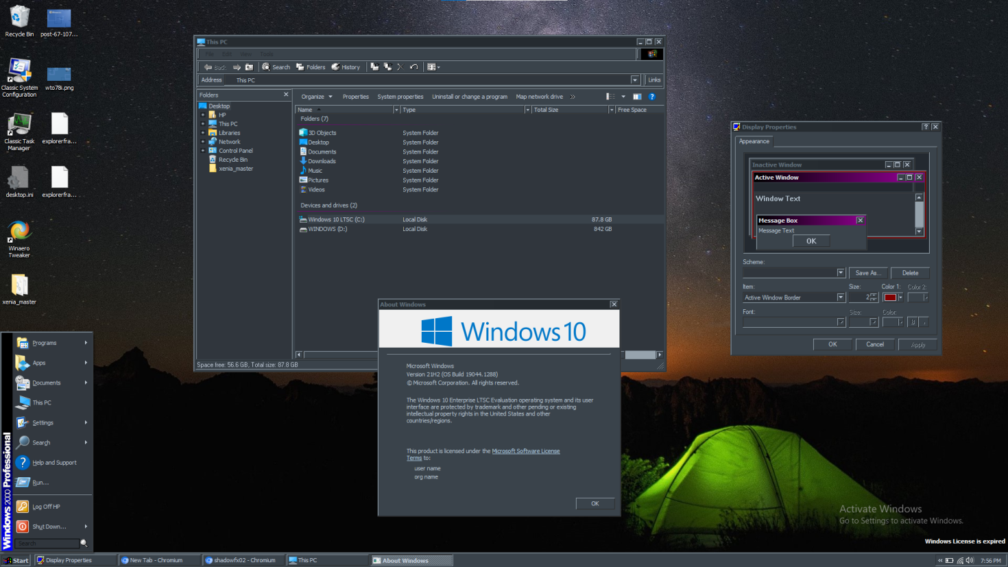
In earlier versions of Windows, you had an immense level of control over the look and feel of your operating system. You could change the fonts used across the system, you could edit the thickness of window borders, and you could change virtually every color for every UI element. The system even included a variety of color schemes to choose from – and you could easily create and save your own. You could truly make it your own. And sure, some (or even a lot) may have been a bit tacky, but the point is that you had the option. And if someone wants their Windows to be eye-searing colors of pink and green, what harm does it do?
One of my favorite examples to point out, though, is to actually point out the modern-day Windows 10 and 11 “dark mode”. To this very day, many applications do not use dark mode properly – only UWP apps and a handful of built-in Win32 applications work, as Microsoft has specifically updated them to respond to dark mode.

However, when using the classic theme, you could create a dark theme that was perfectly consistent system-wide:
Now, maybe you’re wondering – what’s the problem then? Yeah it’s kind of silly that the official dark mode is imperfect compared to classic theme, but if you can just use classic theme – then what’s the issue?
Well, in Windows 8, the classic theme was removed as a standard option. In Windows 7 and prior, enabling classic theme was a painless process – just go to themes and choose classic theme. You could save custom color schemes and everything just like in earlier versions of Windows. But in Windows 8, that option was gone. Kind of.
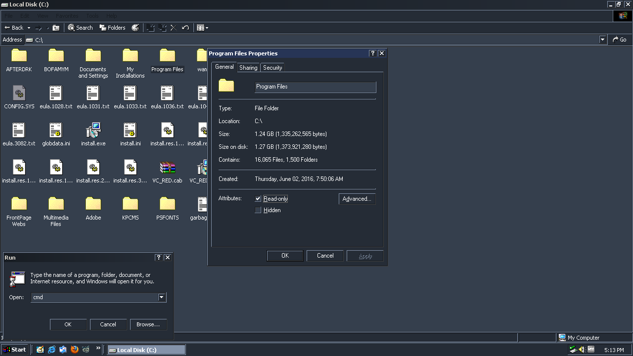
You may notice that of the two classic screenshots, one of them is taken on Windows 10. How is that possible if the classic theme was removed? Well, the option was removed – the theme itself is still an integral part of the system. In a sense, the newer MSStyles themes used in XP and onward sort of sit on top of the original classic theme – not literally, but they’re a sort of add-on to the OS, as they weren’t there from the start. The classic theme on the other hand is deeply baked into the OS, as for quite a long time, that was the only visual style that existed. You can think of it as a sort of “unthemed” look. As such, there’s no real way to truly remove it – instead, the option to enable it was removed (along with the basic theme), and no further care or attention was made to ensure compatibility with it.
As such, enabling classic on Windows 8 and beyond will always have inherent problems – UWP apps will crash without special care to ensure that visual styles are enabled, context menus don’t work properly, and things generally are just not as clean of an experience as on Windows 7. It can be made to work, and work relatively well, but it requires a stack of 3rd-party software in order to be usable – and still won’t be as seamless as before.
However, there is one, special theme that does exist on 10 and 11, that has most of the same color customization – the new Ease of Access themes.
By default, you can’t customize them very much – and they still don’t have the same degree of configuration as the classic theme. But they do give you a relatively decent amount of control over system colors, and will work across the entire system – including in UWP apps. That, and they have a bit more of a modern look – which might be a positive or a negative, depending on whether you’re specifically after the old-school retro look or not.
However, things of course can’t be that simple – you see, the problem is that in order to get a theme like this, you’re stuck manually editing a .theme file. If you want it to show in the color scheme list in Settings, you have to add it to the High Contrast themes folder – and every time you change it, Windows will attempt to delete any custom themes you’ve added there. If you’re lucky, it’ll come up with a prompt requesting administrative permission to delete the file – and you can then deny it, keeping your themes intact.
Deeper Customization – GitKraken 9.0, Discord, Google Chrome
However, some (including myself) want more granular control than just being able to change a few colors here and there. We want to be able to have complete say over the look and feel of a program.
Discord is one that I use often, and will keep BetterDiscord installed in order to use custom CSS. The styles I use are a sort of weird mismash of old and new styles – as I don’t mind every single change Discord makes – but there are some that really bug me. Most of the changes I’ve made are relatively subtle – but a few examples include:
- Revert tooltips to use the original smaller font, reduced padding, and the original blurple background color rather than black
- Reverting the “blurple” color change to use the original color, rather than the mostly-blue color used nowadays
- Increase the size of the title bar
- Revert the logo in the title bar to be a standard sans-serif font (because I really, REALLY hate the new logo – and Segoe UI text that just says “Discord” looks significantly better to me
- Revert embeds to their original appearance – with smaller fonts, less padding, slightly brighter background colors, and so on
- Revert @mentioned messages yellow background and border to not span the full width of the chat panel
- Revert chat input field to its original 2016 appearance
- Reduce default message font size
- Re-introduce small dividing lines between messages
- Remove some of the rounded corners in certain areas
Would you believe me if I said that wasn’t even all of the changes?
A lot of those are simple, subtle CSS tweaks – that is only made possible thanks to the fact that Discord’s entire UI is effectively a website – and the desktop client being a glorified web browser.
Another application that unfortunately doesn’t have any 3rd party tools for custom CSS is something a bit more specific – a Git client called GitKraken. For those unfamiliar, Git is a piece of software that developers will often use to make collaborating on a single codebase simpler and more efficient – and GitKraken is a GUI that uses Git under the hood, since Git by itself is a command-line utility.
Recently, GitKraken announced a 9.0 update – and with it, more appearance changes. Not significant ones thankfully, but changes that I feel are worse and will make it just a bit harder to read and look at. Most of their appearance changes revolve around reducing colors – as in, changing backgrounds to use the same color, rather than having distinct background colors in certain areas to aid visibility.
The stated reason for this is to “reduce clutter” – which, hey, maybe some people prefer it – that’s fine. But I don’t – and as per usual, no care seems to be given to anyone who prefers the old look.
Now, maybe you like the new change – that’s fine. But what about those who find the old appearance easier to read? And it’s not as though you can (easily) download old versions, either – GitKraken only offers their latest version for download, with no way to download earlier releases officially. The best you can do is simply block GitKraken’s update servers and never update again.
The last example I’ll cite here is Google Chrome – it has gone through several significant design language overhauls. From the original design, to material design, to a further dive into material that stripped the classic trapezoid tab shape away.
But the real kicker about Chrome? While they were working on these new visual styles, the old one could be temporarily reverted to by using Chrome’s flags – until eventually the flag was removed. They literally went to the trouble to implement a toggle to swap between old and new visual designs – only to then later remove that toggle.
The “Reason” Why
Alright – so why? Why is there so little care and attention given to user customization? Why does user theming seem to be a somewhat rare breed nowadays?
Well, the most commonly cited reason is that it would simply be too much effort and headache to maintain. The time spent trying to maintain theme support and ensure things look correct across the board is just too much to manage – and that time is better spent elsewhere.
On one hand, I can somewhat understand. It does take some additional time to have this kind of support – however, I have one counter-argument to this whole thing: two forums that I run for Chaotic United and Elaztek Studios, especially Chaotic United.
Chaotic United was founded in 2011, and in 2014 it closed down officially – until I picked the name up in late 2014 and have continued running it ever since. It hasn’t yet reached the same peaks of population that the old CU did, but it’s a tightly-knit community and it’s something I still love operating and maintaining. The CU forums are considered the central hub for the community, though they are (for now) much less active than the CU Discord – even so, the forums continue to receive new features and visual overhauls as time goes on – designed by yours truly.
However, while I consistently try my best to ensure that the newer forum designs are a balanced blend of old and new – that they feel modern but still respect CU’s history, I also understand that there may be a minority of users who may simply feel differently – and will want to stick with the old look.
That’s fine – and on the current CU forums, I have taken care to maintain a large library of themes – and while some do need some touch-ups here and there (and while a couple old 2012-era themes are still absent), I continue to work to ensure these themes are brought back, that they continue to work and look the way they used to, and ensure that end-users can choose whatever design they like – from the most modern of styles, to the original look from 2012, to everything in between – including themes from other communities that have merged with us over the years – Nuclear District being the most significant, but also United AlyCraft, Tidal Wave Gaming, Hurricane Craft, and more.
Again, I will readily admit that some of these themes do need some touch-ups, however many are still quite close and are all entirely functional. Most of the fixes and touch-ups are more for historical accuracy, down to more subtle details.
Along with the website, I am also developing a game engine called Blamite for Elaztek Studios – and this engine’s Editing Kit (as in, the tools used to create content within the game engine) also support full theming. As of right now, the tools are built using the Qt5 framework – and Blamite’s toolset allows for full QSS stylesheets to be used, with additional support for swapping resources such as images and icons, and the ability to have quick variants for things like color swapping.
The point with all this – if it’s so difficult and arduous to maintain previous styles and appearances alongisde newer ones – or to even at least retain support for users to do the work themselves, then how is it that I, as one dude, am able to maintain such a massive library of themes on a website singlehandedly? How is it that my software that’s still so early in development manages to have fairly rich and extensive theme support, even including documentation for users on how to do so?
This is why I don’t buy this whole “it’s too difficult/time consuming” argument. I know what it takes to make user-customizable websites and applications. I know what it takes to have this support – it isn’t that difficult to do. Does it take more work than not doing it? Sure. Will most people just deal with changes and not bother? Again, sure – I admit that most users will likely not bother using anything other than the default look and feel of whatever it is they’re using.
But if it’s a feature that’s clearly not that difficult to implement, why not go the extra step and include it? Even if you don’t want to maintain it consistently, you could simply include a notice of some sort, or bury it in some kind of advanced options – something, anything would be better than what we deal with right now.
The other issue is in cases like I mentioned before with Chrome – where the option was literally present to revert a UI overhaul, they went to the trouble to add the toggle, and then took it out a couple versions later. Why even bother adding the toggle then? Better yet, why not just leave the toggle in? Chrome’s flags already include a “these are experimental and may cause issues” warning – why not just leave it in and let the handful of users who want to roll back their UI do so? What is the harm in that?
I could keep going for hours about this subject. YouTube is another example of a website that gets flak for removing features that people enjoy (video responses, annotations, sorting videos by oldest, dislike counters, exact subscriber counts, so on and so forth) and for overhauling its visual design – often to the frustration of its users. Twitter did the same a while back, introducing a new visual design and removing the old one – when they once again already went to the trouble of adding a new design, so did Facebook, and probably countless other websites.
Closing Thoughts
I suppose more than anything, I’m just frustrated at this whole situation. I’m someone who deeply cares about how their software looks and feels – and I tend to have a much stronger attention to detail, to the point of noticing subtle changes almost instantly – where others just won’t notice at all. As such, these changes likely bother me more than most. And sure, I’m probably in the minority of users.
But just imagine, if Windows 10 or 11 still had a fully supported Classic theme – or better yet, an Aero or Luna theme. Imagine if you could choose to make your Windows 11 look like your favorite version of Windows – whether you’re feeling nostalgic, or just dislike the modern look – imagine if you could just pick what you wanted and stick with it.
Imagine if Google Chrome let you choose between the original design, the material refresh, or its current design. Imagine if GitKraken let you choose whether you wanted reduced colors or if you wanted the older design. Or better yet, imagine if GitKraken straight up let you use custom CSS to style the application however you wanted – there’s no reason they couldn’t do it, it’s just an electron app – which just like Discord, means the UI is a glorified webpage that can be easily styled.
Imagine if YouTube let you use any of its older visual designs, where you could walk through time and see how YouTube’s design has grown and evolved since its inception, and where each user could just pick what design they like the best and stick with it. Imagine if Twitter or Facebook or whoever else just kept their old looks around and let you change a setting to pick what you wanted?
What is the harm in any of this? Who does this harm? If you ask me, nobody. It takes a bit more development time, yes – but in doing so, you absolutely eliminate all of the complaints that arise online every single time that these programs or websites get UI overhauls.
I hope that someday this kind of thing can become a reality, that this kind of issue gets a bit more love and attention the way it used to in some cases – and while I can’t control what other companies do, I can control what I do, and what my own company does. This is why when it comes to any websites I make or maintain, or any software made by Elaztek Studios, this kind of customization is made front and center, and prioritized. It’s why that even in 20 or 30 years, these websites will still have their large libraries of themes available – letting users decide how they want the websites to look – whether they want the modern look, or the old look going back to 2012.
And if you happen to work at one of these companies, or work on one of these softwares or websites, maybe see if you can get a feature like this through the door – even if it’s imperfect or a bit more power-user focused, just allowing this kind of thing to exist hurts nobody, and prevents people like me from either hacking up the software to get it how I want, or from avoiding updating for years on end to keep the old look, or from simply saying “to hell with it” and using something else entirely.