Yeah, it’s a pretty specific topic – but this is something that has always bugged me about the Bedrock Edition of Minecraft.
What is Bedrock Edition?
First, however – a brief summary of Minecraft and its various editions, for those unaware. If you’re already familiar with Minecraft and what Bedrock Edition is, feel free to skip over this section.
For the most part, Minecraft has always been primarily a Java-based game. That version (originally just named “Minecraft”) has been renamed to Minecraft: Java Edition and is still the most popular way to play the game.
For a while, however, there was Minecraft: Console Edition (or Legacy Console Edition, as it’s now known) which started on the Xbox 360 was gradually ported to various other consoles. Eventually, however, that version was retired after reaching parity with Minecraft 1.13 – and was replaced with Minecraft: Bedrock Edition (now officially titled “Minecraft”).
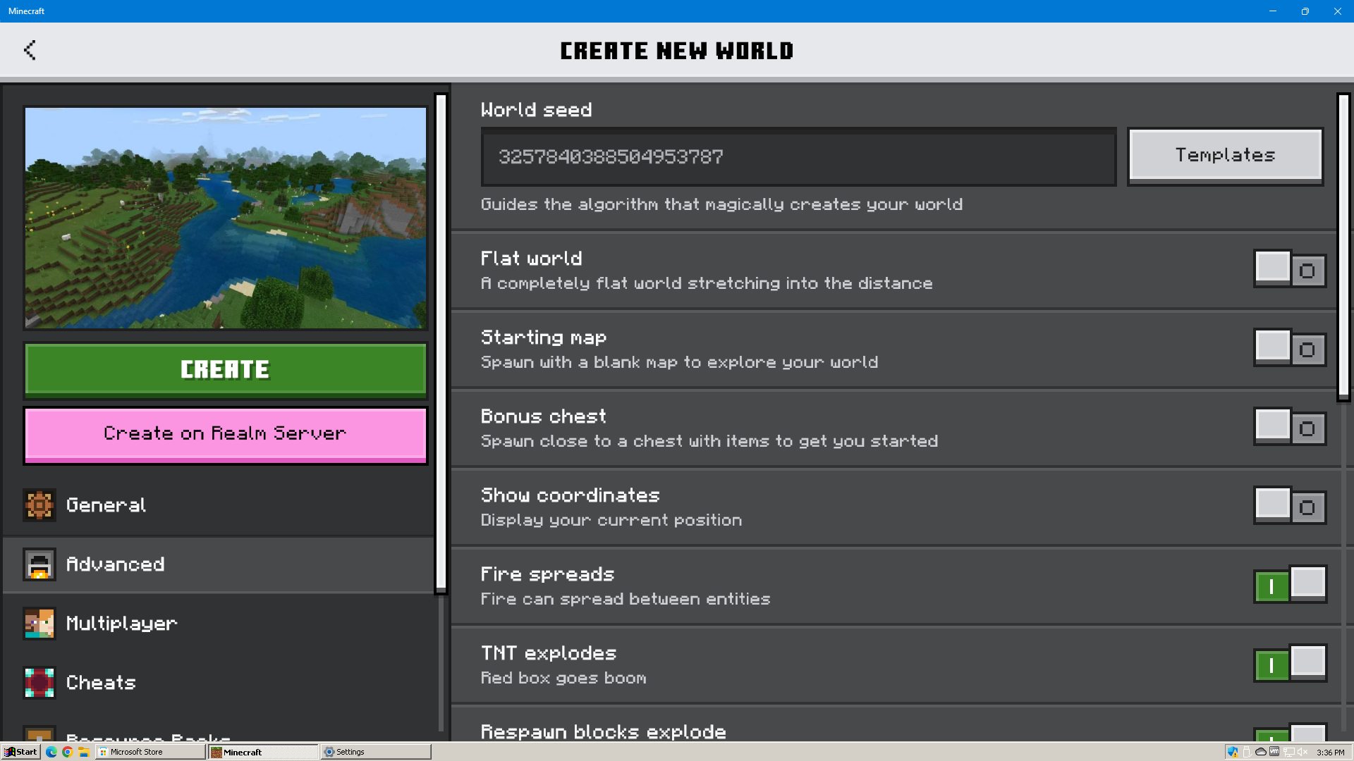
The Bedrock edition of the game runs on most modern consoles, as well as Windows 10 and 11. All Bedrock versions support cross-play with one another, and are all at equal feature parity.
The GUI/Font Problems
With that out of the way – lets talk about fonts.
In Java Edition, there are a grand total of two fonts you will ever see – and mostly just one. There is the default (or as Bedrock calls it, “Mojangles”), and there is the unicode font. Both fonts are pixelated, though the unicode font is at a higher resolution in order to more clearly display more detailed characters. Unless you explicitly enable it, either by forcing it on in language settings or by choosing a language which requires it, virtually everything in the game will use the standard font. The default font does look the best when paired with Minecraft’s pixelated art style, however neither look outright out of place – as both sport a pixelated art style.
In Bedrock edition, however, this is not the case. For reasons that are not publicly known, many areas of Bedrock Edition’s UI uses a font called Noto Sans – which is about as far removed from a standard, pixelated Minecraft font as you can get.
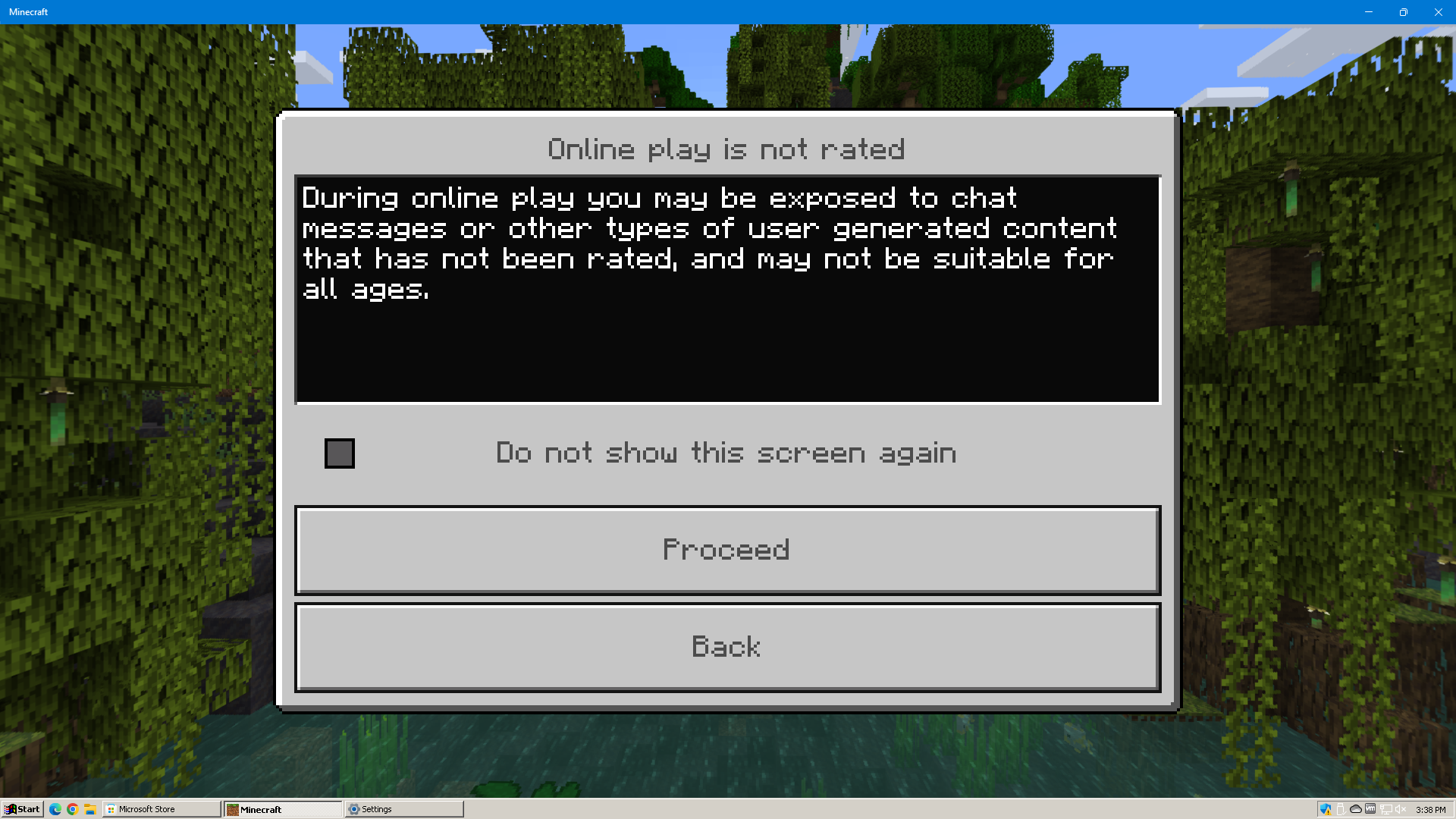
For example, as of writing, this is the first thing you see when installing Bedrock Edition on Windows 11 and you get past the initial Mojang splash and loading screen:
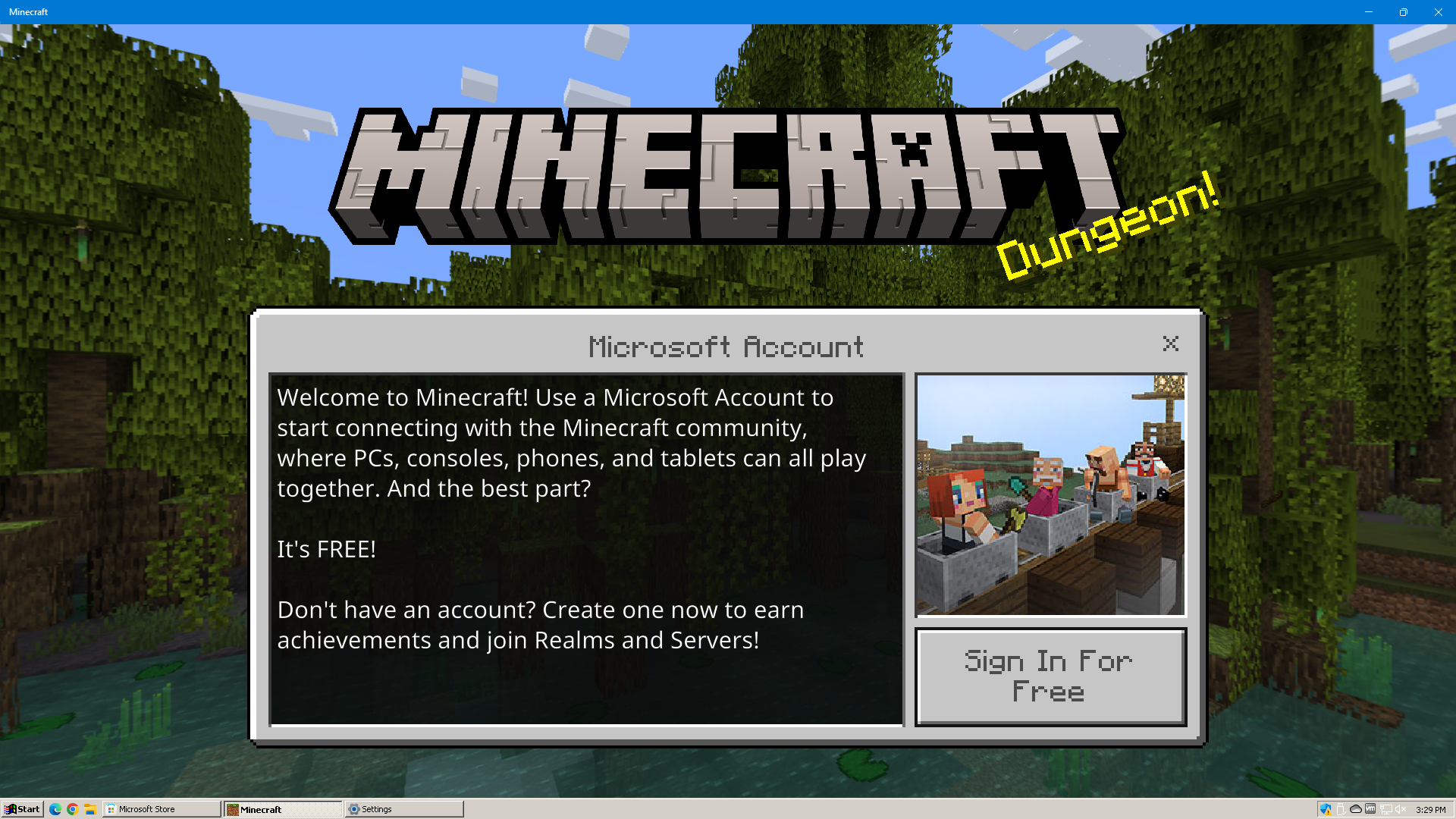
This dialog box features the use of two fonts – the classic Minecraft font – seen on the Sign In button and title bar, and Noto Sans – which is used in the main message contents of the dialog.
Why? Who knows? And this isn’t the only place, either.
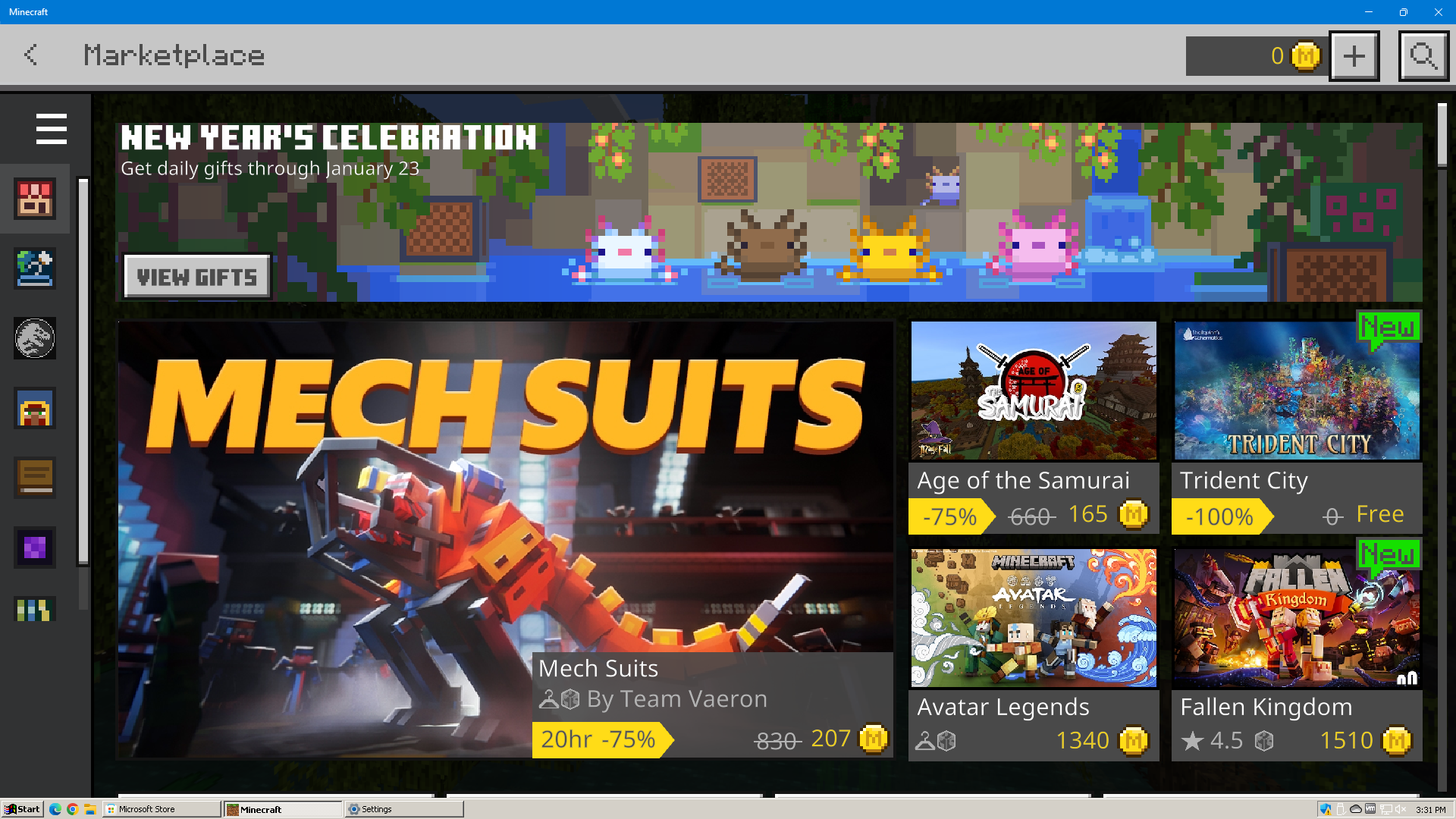
What the hell is going on here? In the Marketplace, almost everything is Noto Sans – except a few places where it uses a different pixelated font for some headers and the View Gifts button, and the title which uses the normal Minecraft font.
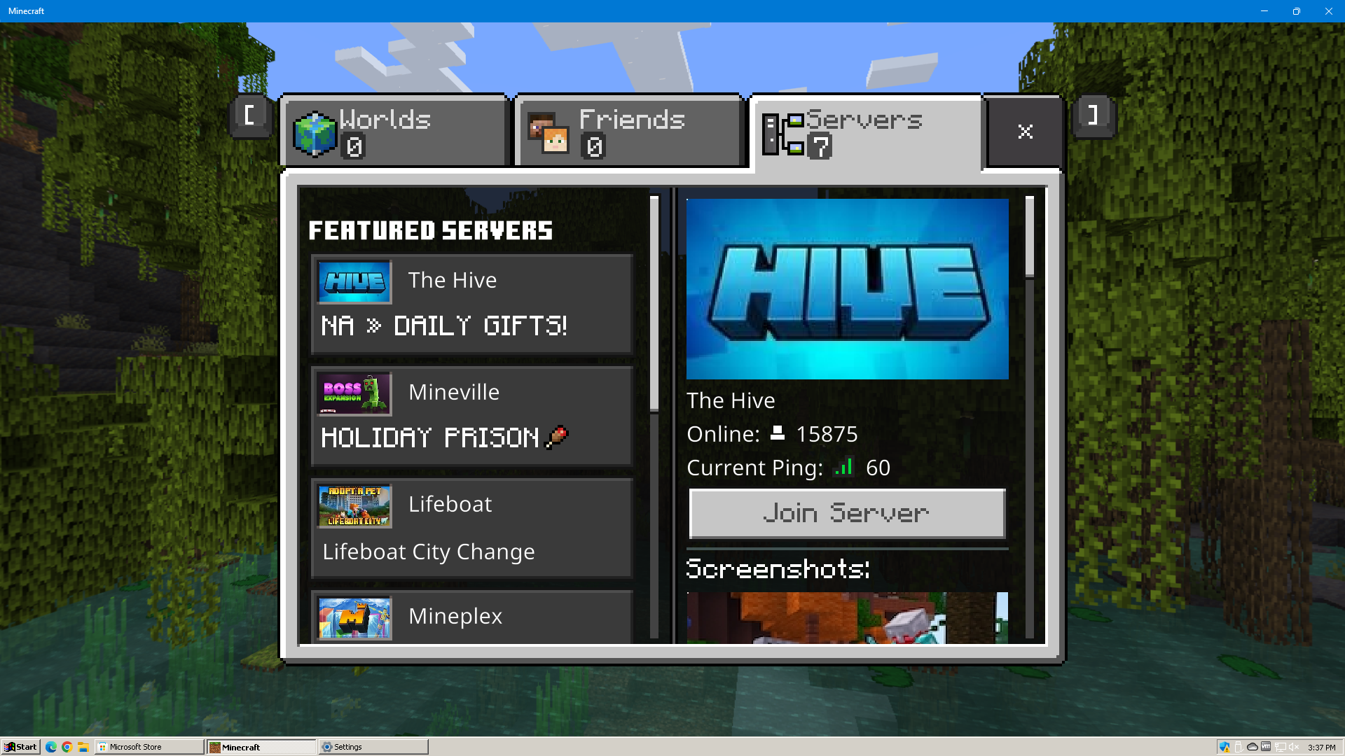
In the server browser, server information for the selected server is mostly in Noto Sans, but the Join button and Screenshots message are in the Minecraft font. In the list itself, server titles are in Noto Sans, with some server MOTDs being in the Minecraft font, and others being in Noto Sans.
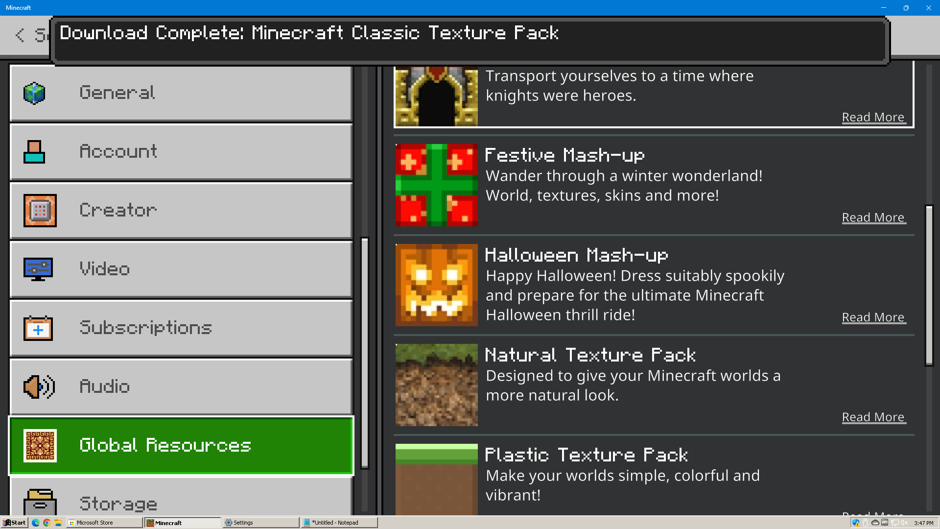
In the resource pack menu, almost everything is in the standard Minecraft font – except for resource pack descriptions, which are naturally in Noto Sans.
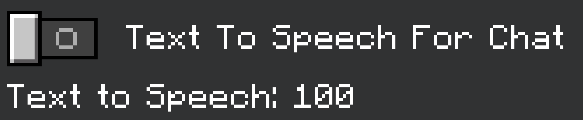
At one point, in-game chat even defaulted to Noto Sans. Thankfully, this isn’t the case anymore – instead, Noto Sans is merely a setting you can adjust if you want. Which, while it still seems out of place, it being a toggle that users can choose is perfectly harmless – and hey, maybe for some people, they find Noto Sans more legible? As an option, this is a nonissue – but when it’s inconsistently used across the user interface like this, with no way to change it? And to have this kind of stuff be the default? To me, this is unacceptable and just seems lazy, like nobody at Mojang or Microsoft care about visual consistency across the UI for one of their flagship titles, and one that is among the most well-known and popular in the world.
Now maybe you’re thinking – well, maybe they just needed to use a more flexible or compact font to fit information on all of these areas? Maybe – but why not then just use a different, but still pixelated font instead? There’s a lot of ways to solve this issue without having a font that literally looks like a mistake – like they were designing a UI in whatever design software and just forgot to edit the font from the default.
Oh, and there are other dialogs which in fact do use the standard font – for instance:
You get this screen when first connecting to an online game. Notice how the UI actually looks consistent, no weird fonts thrown in for no reason?
And, in fairness – it does appear that they have somewhat taken note of this issue. As their newer, redesigned user interfaces don’t use Noto Sans at all – but do in fact use the proper, original Minecraft font.
Except, there’s still one glaring issue. Because of course there is. See if you can spot it yourself below:
You may need to open them in fullscreen to see – but in case you still don’t, allow me to point out the key issue. On the left, the text is nice and crisp. Looks quite nice – it looks the way Minecraft ought to look. On the right, however, it seems like the same font, but something is a bit… off. The text appears a bit… blurred. It seems that their newer UI system doesn’t play very nicely with their pixelated fonts. My guess is that they’ve converted the font to a TrueType font – which generally requires some extra effort when pixelated fonts are used.
To their credit, the font looks a fair bit better than the community-made “Minecraftia” font – which has some really bizzare inaccuracies that I don’t know how they even happened – particularly with lowercase Ts. It seems to mostly display with the right proportions, scale, and spacing – it’s just a bit fuzzy when compared to the perfectly crisp and clean fonts seen elsewhere.
To their credit as well – I’ll take this over the ridiculously out-of-place Noto Sans any day of the week. I just hope that they address those issues and get the font to look a bit crisper – if so, these new UI’s will actually likely end up looking quite nice.
But, I think that’s about all I have to say on the subject for now. I was reminded of this issue after running into similar issues myself when working on a game in Unity – before switching the project over to Godot. But that will have to be a post for another day.
Stay tuned.